1. Introduction: Key Attributes of Populations
In biology, a population is defined as a group of organisms of the same species inhabiting a particular location.
1a. Population size
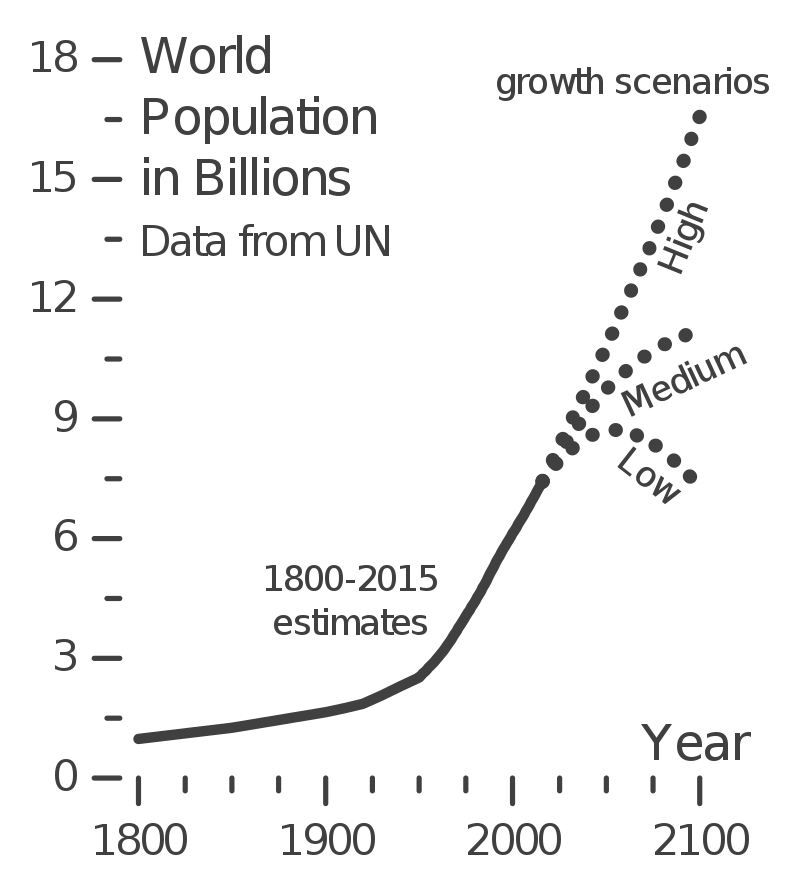 The diagram to your left, which uses data from the United Nations, shows how the size of humanity’s population has changed over the past two hundred years. The Earth’s human population was about one billion in 1800. In 1961 (when Mr. W. was born), it was three billion. Now, it’s about 7.5 billion.
What about the future? It depends on a variety of factors, especially birth rate (the number of births/year). The low projection sees the human population reaching a maximum size in about 2040, then starting to decline. Why? because in many parts of the world, birth rates are falling. The medium projection sees population growth continuing, but at a slower rate. And the high scenario sees the current rate continuing.
As human populations have grown, populations of wildlife have fallen. These numbers are less precise, but it’s thought that there were about 12 million African elephants in the early 1900s. Now there are about 350,000 (source: Africa Geographic).
Size is perhaps the most obvious way to characterize a population. Let’s continue by looking at some others.
1b. Density
Density is usually measured as the number of individuals/unit area. For example, a 1990 study of lions in Serengeti National Park determined, in one area of the park, a density of one lion/4 km2. However, when an organism inhabits a three-dimensional space, like air or water, density is usually expressed as individuals/unit volume. For example, a liter of seawater may contain as many as 100 billion viruses.
1c.Range
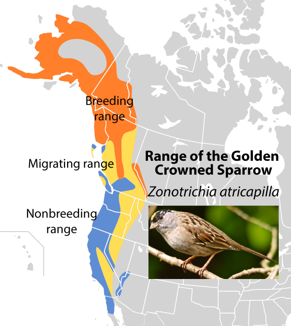 Range. The range is where a population is found. That can be the specified area of a population that you’re studying, such as the wolves of Yellowstone National park. Or, as is shown on the left, it can be the total possible range of a species.
Note that the range is dynamic, shifting over time. In the summer, populations of Golden crowned sparrows will surge in Northwest Canada and Alaska. During the winter the sparrows retreat to the warmer temperatures and more abundant food that can be found in western British Columbia, Washington, Oregon, California, and Baja California.
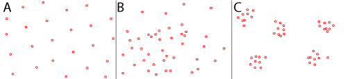
1d. Dispersion Pattern
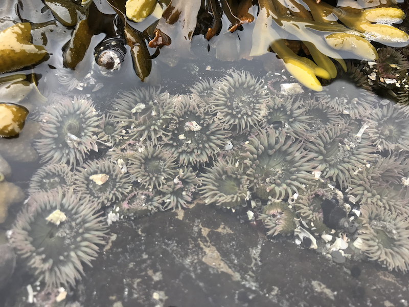
Within a population’s range, a population will generally clump around a particular resource or habitat. For example, in an intertidal zone, you’ll find sea anemones clumped around tide pools. In an African savannah, there will be dense arrays of wildlife around watering holes.
Clumping (“C,” below) is the most common dispersion pattern. However, individuals within a population can also, in specific circumstances, space themselves out in a uniform pattern (see “A” below). This is seen in bird colonies, where territorial interactions force nesting birds to spread themselves out at a safe distance from their neighbors (who would be happy to eat an unguarded chick in a neighboring nest). Another dispersion pattern is seen in the way dandelions spread out over a lawn. Since each plant’s location is a function of where a wind-blown seed randomly lands, the resulting plants will often be randomly distributed (“B” below).
1e. Age structure
Populations can be characterized by the number of individuals of various age brackets. A population’s age-structure can be represented by a population pyramid (though these pyramids might not be very pyramidal in shape, as you’ll see below).
Take a moment and study the graph below to see what you can learn from it.
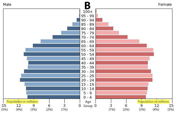 You can think of an age structure graph as being two bar graphs. In this particular age structure graph, the bars on the right are for this country’s females (note the label in the upper right corner). The bars on on the left are for the males. The Y axis lists age brackets in increments of 5 years: the bottom bar is 0 to 4 years of age the next is 5-9 years, etc. The X axis is number of individuals of that sex in that bracket (as well as, in this case, the percentage of the population).
[qwiz qrecord_id=”sciencemusicvideosMeister1961-pop_ecol, age structure”]
[h] Age structure graphs quiz
[i] A key thing to note about an age structure graph is the relative number of individuals of pre-reproductive age, reproductive age, and post reproductive age, as shown below
[q] In the diagram below, which number represents the age bracket of individuals who are of childbearing age?
[textentry single_char=”true”]
[c]ID I=[Qq]
[f]IFllcyEgTnVtYmVyIDIgcmVwcmVzZW50cyBpbmRpdmlkdWFscyBvZiBjaGlsZGJlYXJpbmcgYWdlLg==[Qq]
[c]IEVudGVyIHdvcmQ=[Qq]
[c]ICo=[Qq]
[f]IE5vLiBZb3UmIzgyMTc7cmUgbG9va2luZyBmb3IgdGhlIGluZGl2aWR1YWxzIHdobyBhcmUgbmVpdGhlciB0b28geW91bmcgdG8gYmVhciBjaGlsZHJlbiwgbm9yIHRvbyBvbGQuIFdoaWNoIG51bWJlciB3b3VsZCB0aGF0IG1vc3QgbGlrZWx5IGJlPw==[Qq]
[q] In the diagram below, which letter represents the population that will grow the most in the future?
[textentry single_char=”true”]
[c]IE E=[Qq]
[f]IE5pY2Ugam9iISBJbiB0aGUgZnV0dXJlLCB0aGUgbGFyZ2UgZ3JvdXAgb2YgcHJlLXJlcHJvZHVjdGl2ZSBpbmRpdmlkdWFscyB3aWxsIGVudGVyIHRoZWlyIHJlcHJvZHVjdGl2ZSB5ZWFycy4gV2hlbiB0aGV5IGRvLCB0aGF0IGxhcmdlIGdyb3VwIG9mIGluZGl2aWR1YWxzIHdpbGwgY3JlYXRlIG1hbnkgb2Zmc3ByaW5nLCBjYXVzaW5nIHRoZSBwb3B1bGF0aW9uIHRvIGdyb3cu[Qq]
[c]IEVudGVyIHdvcmQ=[Qq]
[c]ICo=[Qq]
[f]IE5vLiBZb3UmIzgyMTc7cmUgbG9va2luZyBmb3IgdGhlIHBvcHVsYXRpb24gd2hpY2gsIGluIHRoZSBmdXR1cmUsIHdpbGwgaGF2ZSB0aGUgbW9zdCBpbmRpdmlkdWFscyBlbnRlcmluZyBpbnRvIHRoZWlyIHJlcHJvZHVjdGl2ZSB5ZWFycy4gV2hpY2ggcG9wdWxhdGlvbiBpcyB0aGF0Pw==[Qq]
[q] In the diagram below, which letter represents the population that will grow the least in the future?
[textentry single_char=”true”]
[c]IE E=[Qq]
[f]IE5pY2Ugam9iISBJbiBwb3B1bGF0aW9uIEEsIHRoZXJlJiM4MjE3O3MgYSByZWxhdGl2ZWx5IHNtYWxsIG51bWJlciBvZiBpbmRpdmlkdWFscyBpbiB0aGVpciBwcmUtcmVwcm9kdWN0aXZlIHllYXJzLiBUaGF0IG1lYW5zIHRoYXQgaW4gdGhlIGZ1dHVyZSwgdGhpcyBwb3B1bGF0aW9uIHdpbGwgaGF2ZSByZWxhdGl2ZWx5IGZldyByZXByb2R1Y2luZyBpbmRpdmlkdWFscy4gVGhleSYjODIxNztsbCBwcm9kdWNlIHJlbGF0aXZlbHkgZmV3IG9mZnNwcmluZywgY2F1c2luZyB0aGF0IGNvdW50cnkmIzgyMTc7cyBwb3B1bGF0aW9uIHRvIGRlY2xpbmUu[Qq]
[c]IEVudGVyIHdvcmQ=[Qq]
[c]ICo=[Qq]
[f]IE5vLiBZb3UmIzgyMTc7cmUgbG9va2luZyBmb3IgdGhlIHBvcHVsYXRpb24gd2hpY2gsIGluIHRoZSBmdXR1cmUsIHdpbGwgaGF2ZSB0aGUgZmV3ZXN0IGluZGl2aWR1YWxzIGVudGVyaW5nIGludG8gdGhlaXIgcmVwcm9kdWN0aXZlIHllYXJzLiBXaGljaCBwb3B1bGF0aW9uIGlzIHRoYXQ/[Qq]
[q] In the graph below, females between 65 and 69 make up about what percentage of the population?
[textentry single_char=”true”]
[c]ID M=[Qq]
[f]IEV4Y2VsbGVudC4gVGhlIHBlcmNlbnRhZ2Ugb2YgZmVtYWxlcyBiZXR3ZWVuIDY1IGFuZCA2OSBpcyBhYm91dCAzJS4=[Qq]
[c]IEVudGVyIHdvcmQ=[Qq]
[c]ICo=[Qq]
[f]IE5vLiBGaW5kIHRoZSBwaW5rIGJhciB0aGF0JiM4MjE3O3MgYXQgdGhlIDY1IGFuZCA2OSBhZ2UgZ3JvdXAuIFdoYXQgcGVyY2VudGFnZSBvZiB0aGUgcG9wdWxhdGlvbiBkb2VzIHRoYXQgYmFyIG1ha2UgdXAgKHRoZSBhbnN3ZXIgaXMgb24gdGhlIFggYXhpcywgYW5kIGJlIHN1cmUgdG8gbG9vayBhdCAlKS7CoA==[Qq]
[/qwiz]
1f. Life Tables and Survivorship Curves
Population pyramids like the ones we just examined are built from life tables. A life table represents the survivorship of individual organisms or people from a certain population. What is survivorship? It’s a number that represents, for each age bracket, the probability that an individual will die before his or her next birthday (adapted from wikipedia).
Here’s a life table for the U.S. population in 2003.
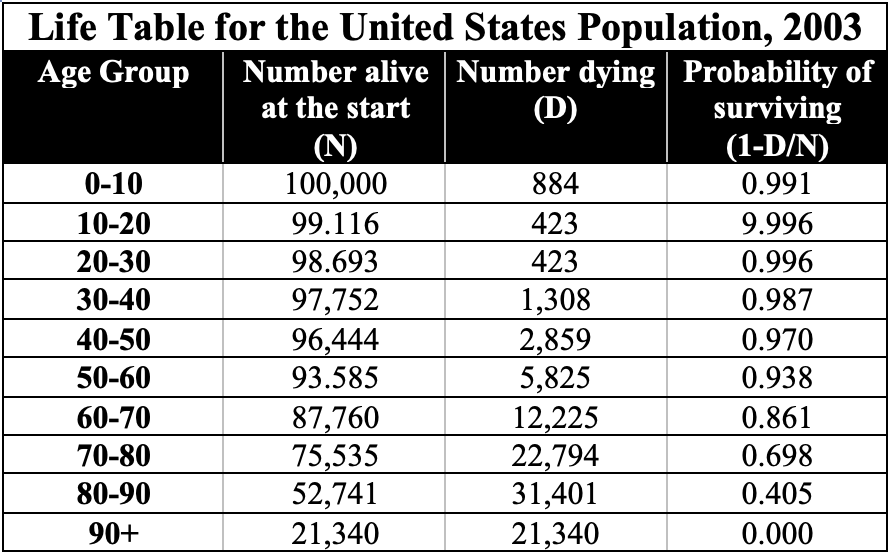
Here’s how a life table works. Find the top row, which has data for 0-10 year olds. For every 100,000 individuals aged 0-10, 884 die, making the probability of their survival through this time period 0.991. Another way to think of this is that someone between ages 0 and 10 has a 99.1% chance of surviving to their next birthday. When these individuals are between age 50 and 60, their probability of their surviving to the next age group is 0.938. However, by the time an individual reaches the 80-90 bracket, their chances of surviving to the next age bracket are down to 0.405 (40.5%).
You can graph these data onto what’s called a survivorship curve. Here’s one built from similar data to what’s shown in the life table above.
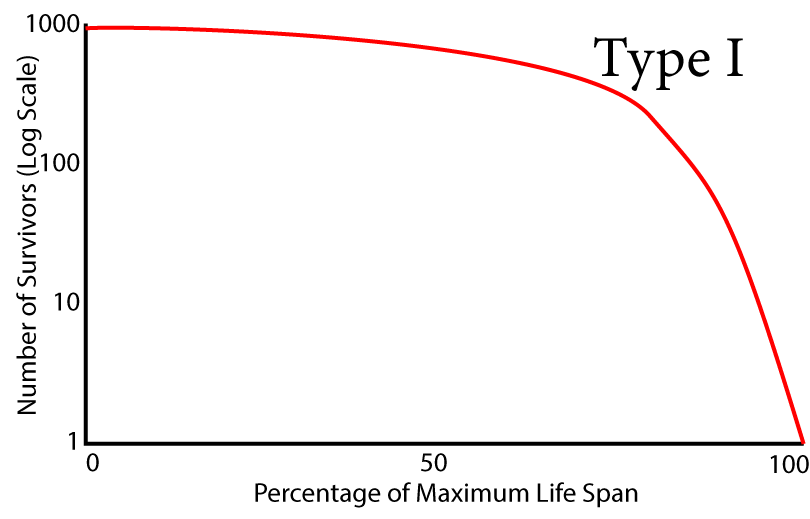 Here’s how to read it. The Y axis represents the number of survivors, starting from an initial population of 1000. Note that the Y axis has a logarithmic scale: the intervals go from 1 to 10 to 100 to 1000. The X axis is linear, and represents the lifespan of this particular species.
The survivorship curve is the red line. Follow it from left to right. Between 0 and 50 (birth and halfway through the lifespan), survivorship slopes very gently downward. That corresponds to the life table above. For example, at ages 30 to 40, most of the individuals born to this population are still alive.
Look again at the survivorship curve. Even 75% of the way through the lifespan, the slope of the line isn’t very steep. But as you get to 80 or 90% of the way through life, the curve starts to slope downward more and more as the death rate climbs and the survivorship declines.
A population like this shows “late loss of life.” That’s true of many human populations today, especially those who live in advanced industrialized countries.
Now let’s look at some survivorship curves for other species.
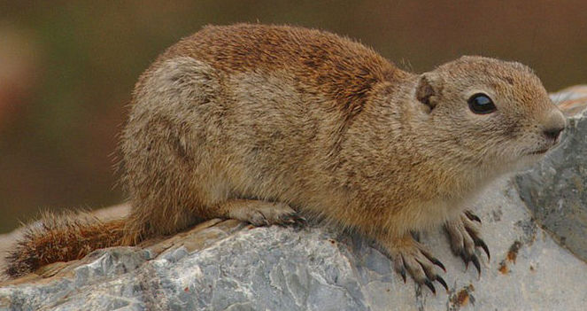
One is Belding’s ground squirrel. This rodent lives in the mountains of the Western United states. Whereas humans have late loss of life, these squirrels experience a constant mortality across the range of their lifespan. As a result, the survivorship curve for these squirrels is constant. That’s what you see in the line labeled “Type II” survivorship curve below.
Now think of animals like an oysters, or frogs. These animals produce enormous numbers of young. Early in life, there’s high mortality. A relatively small percentage the young will survive to become adults. This is shown in the “Type III” survivorship curve.
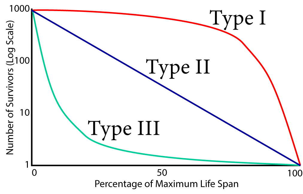
Survivorship curves are associated with specific reproductive strategies. In species with a type 1 survivorship curve, the parents tend to have relatively few offspring, and invest a lot in their survival. In species with a type III survivorship curve, the strategy is to put energy into having enormous numbers of offspring, but to invest relatively little in their survival.
2. Key Attributes of Population: Checking Understanding
[qwiz random = “true” qrecord_id=”sciencemusicvideosMeister1961-pop_ecol, population attributes”]
[h]Key Attributes of Populations
[i]
[q] In the diagram below, which image represents the dispersion pattern that results from territorial interactions, where individuals want to maintain a certain amount of space around themselves?
[textentry single_char=”true”]
[c]IE E=
[f]IE5pY2Ugam9iLiBUaGUgdW5pZm9ybSBkaXN0cmlidXRpb24gcGF0dGVybiBpbiAmIzgyMjA7QSYjODIxNzsgcmVzdWx0cyBmcm9tIHRlcnJpdG9yaWFsIGludGVyYWN0aW9ucy4=[Qq]
[c]IEVudGVyIHdvcmQ=[Qq]
[c]ICo=[Qq]
[f]IE5vLiBUaGluayBvZiBpdCB0aGlzIHdheS4gV2hpY2ggcGF0dGVybiB3b3VsZCByZXN1bHQgaWYgZXZlcnkgaW5kaXZpZHVhbCBmb3JjZWQgZXZlcnkgb3RoZXIgaW5kaXZpZHVhbCB0byBrZWVwIGEgY2VydGFpbiBkaXN0YW5jZSBhd2F5Pw==[Qq]
[q] Imagine a species of grazing animals. These animals congregate around waterholes, which are distributed around a large grassland. Which dispersion pattern would result?
[textentry single_char=”true”]
[c]IE M=
[f]IE5pY2Ugam9iLiBUaGUgY2x1bXBlZCBkaXNwZXJzaW9uIHBhdHRlcm4gaW4gJiM4MjIwO0MmIzgyMjE7IHJlc3VsdHMgZnJvbSBjbHVzdGVyaW5nIGFyb3VuZCBhIHJlc291cmNlLg==[Qq]
[c]IEVudGVyIHdvcmQ=[Qq]
[c]ICo=[Qq]
[f]IE5vLiBIZXJlJiM4MjE3O3MgYSBoaW50LiBXaGljaCBwYXR0ZXJuIHdvdWxkIHJlc3VsdCBpZiBhIHBvcHVsYXRpb24gc3ViZGl2aWRlZCBpdHNlbGYgaW50byBncm91cHMgdGhhdCBjbHVzdGVyIGFyb3VuZCBhIHNwZWNpZmljIHJlc291cmNlPw==[Qq]
[q] Of the three populations below, which one do you anticipate will grow the most in the near future?
[textentry single_char=”true”]
[c]IE E=
[f]IE5pY2Ugam9iLiBUaGUgbGFyZ2UgbnVtYmVyIG9mIGluZGl2aWR1YWxzIHdobyB3aWxsIHNvb24gYmUgZW50ZXJpbmcgdGhlaXIgY2hpbGRiZWFyaW5nIHllYXJzIHdpbGwgY2F1c2UgcG9wdWxhdGlvbiBBIHRvIGdyb3cgdGhlIGZhc3Rlc3Qu[Qq]
[c]IEVudGVyIHdvcmQ=[Qq]
[c]ICo=[Qq]
[f]IE5vLiBIZXJlJiM4MjE3O3MgYSBoaW50LiBUaGUgcG9wdWxhdGlvbiB0aGF0IHdpbGwgZ3JvdyB0aGUgZmFzdGVzdCBpcyB0aGUgb25lIHRoYXQgd2lsbCBoYXZlIHRoZSBtb3N0IGluZGl2aWR1YWxzIGVudGVyaW5nIGludG8gdGhlaXIgY2hpbGRiZWFyaW5nIHllYXJzLg==[Qq]
[q] Of the three populations below, which one do you anticipate will be the most stable in terms of population size?
[textentry single_char=”true”]
[c]IE I=
[f]IEdvb2Qgd29yayEgSW4gcG9wdWxhdGlvbiBCLCB0aGUgbnVtYmVyIG9mIGluZGl2aWR1YWxzIG9mIGNoaWxkIGJlYXJpbmcgeWVhcnMgd2lsbCBiZSByZXBsYWNlZCBieSBhbiBlcXVhbCBudW1iZXIgb2Ygc3VjaCBpbmRpdmlkdWFscy4gQXMgYSByZXN1bHQsIHRoZSBudW1iZXIgb2Ygb2Zmc3ByaW5nIGJvcm4gaW4gdGhlIGZ1dHVyZSBzaG91bGQgcmVtYWluIHJlbGF0aXZlbHkgY29uc3RhbnQgb3ZlciB0aW1lLg==[Qq]
[c]IEVudGVyIHdvcmQ=[Qq]
[c]ICo=[Qq]
[f]IE5vLiBIZXJlJiM4MjE3O3MgYSBoaW50LiBQb3B1bGF0aW9ucyB3aWxsIGdyb3cgd2hlbiB0aGUgbnVtYmVyIG9mIGluZGl2aWR1YWxzIG9mIGNoaWxkLWJlYXJpbmcgeWVhcnMgaW5jcmVhc2VzLiBQb3B1bGF0aW9ucyBkZWNyZWFzZSB3aGVuIHRoZSBudW1iZXIgb2YgaW5kaXZpZHVhbHMgb2YgY2hpbGQtYmVhcmluZyB5ZWFycyBkZWNyZWFzZXMuIFRoZXkmIzgyMTc7bGwgc3RheSB0aGUgc2FtZSB3aGVuIHRoZSBudW1iZXIgb2YgaW5kaXZpZHVhbHMgb2YgY2hpbGQgYmVhcmluZyB5ZWFycyBzdGF5cyB0aGUgc2FtZS4gSW4gd2hpY2ggcG9wdWxhdGlvbiB3aWxsIHRoZSBudW1iZXIgb2YgaW5kaXZpZHVhbHMgb2YgY2hpbGQgcmVhcmluZyB5ZWFycyBzdGF5IHRoZSBzYW1lPw==[Qq]
[q] Which survivorship curve is characterized by early loss of life?
[textentry single_char=”true”]
[c]IE M=
[f]IE5pY2Ugd29yayEgU3Vydml2b3JzaGlwIGN1cnZlIEMgc2hvd3MgJiM4MjIwO2Vhcmx5IGxvc3Mgb2YgbGlmZS4mIzgyMjE7[Qq]
[c]IEVudGVyIHdvcmQ=[Qq]
[c]ICo=[Qq]
[f]IE5vLiBIZXJlJiM4MjE3O3MgYSBoaW50LiBGaW5kIHRoZSBjdXJ2ZSB3aGVyZSBtb3N0IGluZGl2aWR1YWxzIGRpZSB3aXRoaW4gdGhlIGZpcnN0IDEwIHRvIDIwIHBlcmNlbnQgb2YgdGhlaXIgbWF4aW11bSBsaWZlc3BhbiwgYW5kIHJlbGF0aXZlbHkgZmV3IGxpdmUgYmV5b25kIHRoZSBtaWRkbGUgb2YgdGhlIGxpZmVzcGFuLg==[Qq]
[q] Which survivorship curve is characterized by late loss of life.
[textentry single_char=”true”]
[c]IE E=
[f]IE5pY2Ugd29yayEgU3Vydml2b3JzaGlwIGN1cnZlIEEgc2hvd3MgJiM4MjIwO2xhdGUgbG9zcyBvZiBsaWZlLiYjODIyMTs=[Qq]
[c]IEVudGVyIHdvcmQ=[Qq]
[c]ICo=[Qq]
[f]IE5vLiBIZXJlJiM4MjE3O3MgYSBoaW50LiBGaW5kIHRoZSBjdXJ2ZSB3aGVyZSB2ZXJ5IGZldyBpbmRpdmlkdWFscyBkaWUgd2l0aGluIHRoZSBmaXJzdCAzLzQgb2YgdGhlaXIgbWF4aW11bSBsaWZlc3BhbiwgYW5kIHJlbGF0aXZlbHkgZmV3IGRpZSB3aGVuIHZlcnkgeW91bmcu[Qq]
[q] Which survivorship curve is characterized by constant loss of life.
[textentry single_char=”true”]
[c]IE I=
[f]IEF3ZXNvbWUhIFN1cnZpdm9yc2hpcCBjdXJ2ZSBCIHNob3dzICYjODIyMDtjb25zdGFudCBsb3NzIG9mIGxpZmUuJiM4MjIxOw==[Qq]
[c]IEVudGVyIHdvcmQ=[Qq]
[c]ICo=[Qq]
[f]IE5vLiBIZXJlJiM4MjE3O3MgYSBoaW50LiBUaGUgcmVhc29uIHdoeSB0aGlzIGdyYXBoIHVzZXMgYSBsb2dhcml0aG1pYyBzY2FsZSBpcyB0aGF0IGl0IHNob3dzIGNvbnN0YW50IGxvc3Mgb2YgbGlmZSBhcyBhIGNvbnN0YW50IHNsb3BlLiBXaGljaCBsaW5lIGZpdHMgdGhhdCBkZXNjcmlwdGlvbj8=[Qq]
[q]The graph below is called a [hangman] curve. Line A represents a population with [hangman] loss of life. The vast majority of the individuals in this population [hangman] past the middle of this population’s expected lifespan. By contrast, curve B represents [hangman] loss of life, and curve C represents [hangman] loss of life.
[c]c3Vydml2b3JzaGlw[Qq]
[c]bGF0ZQ==[Qq]
[c]c3Vydml2ZQ==[Qq]
[c]Y29uc3RhbnQ=[Qq]
[c]ZWFybHk=[Qq]
[/qwiz]
What’s next?
Continue to Understanding Population Growth (the next tutorial in this module)